Making Networking Safer and Quicker
FinanciaHogar
Product UX/UI Designer, WordPress Developer
Figma, WordPress, Divi Theme, Miro
2021
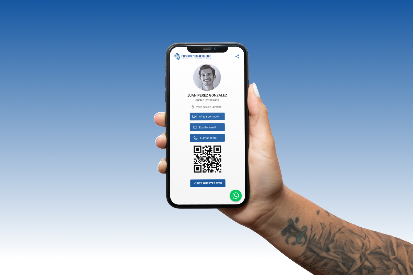
FinanciaHogar’s Digital Business Card is a web-based mobile business card made with WordPress. It provides a digital solution that eliminates the need for paper business cards, offers a more convenient way for real estate agents to share their contact details with clients, and helps FinanciaHogar to reduce its carbon footprint and operations expenses. My role was to design the user experience & interface of the card and to develop the web-based digital card using WordPress. I collaborated with FinanciaHogar’s management, operations and sales teams to launch this project.
The Client
FinanciaHogar is a leading real estate network based in Tenerife, with over 15 years of experience in the industry. As the first real estate network on the island, Financiahogar has quickly become a reference in the sector thanks to its commitment to quality, transparency, professionalism, efficiency, and effectiveness. With four offices on the island, Financiahogar has a team of specialised professionals in sales, rentals, and financing who offer a personalised service to guide clients through every step of the transaction process.
The Challenge
In today’s fast-paced digital world, networking is a crucial part of any business strategy. With traditional paper business cards quickly becoming obsolete, Financia Hogar needed a modern and efficient solution to connect with potential clients or customers in person.
Additionally, in light of the COVID-19 pandemic, many people were hesitant to touch physical objects such as traditional business cards, further highlighting the need for a digital alternative.
The challenge was to design a digital business card that is user-friendly, visually appealing and provides all the necessary information a potential client or customer may need to connect with real estate agents, taking into account the current health and safety concerns, and providing a contactless way to exchange information.
Furthermore, the client needed a user-friendly backend system for its employees to manage the cards without relying on designers or developers for every update and new card creation.
The SOLUTION
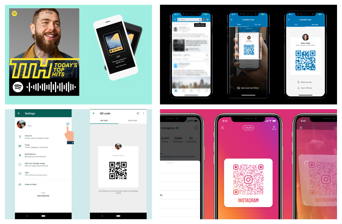
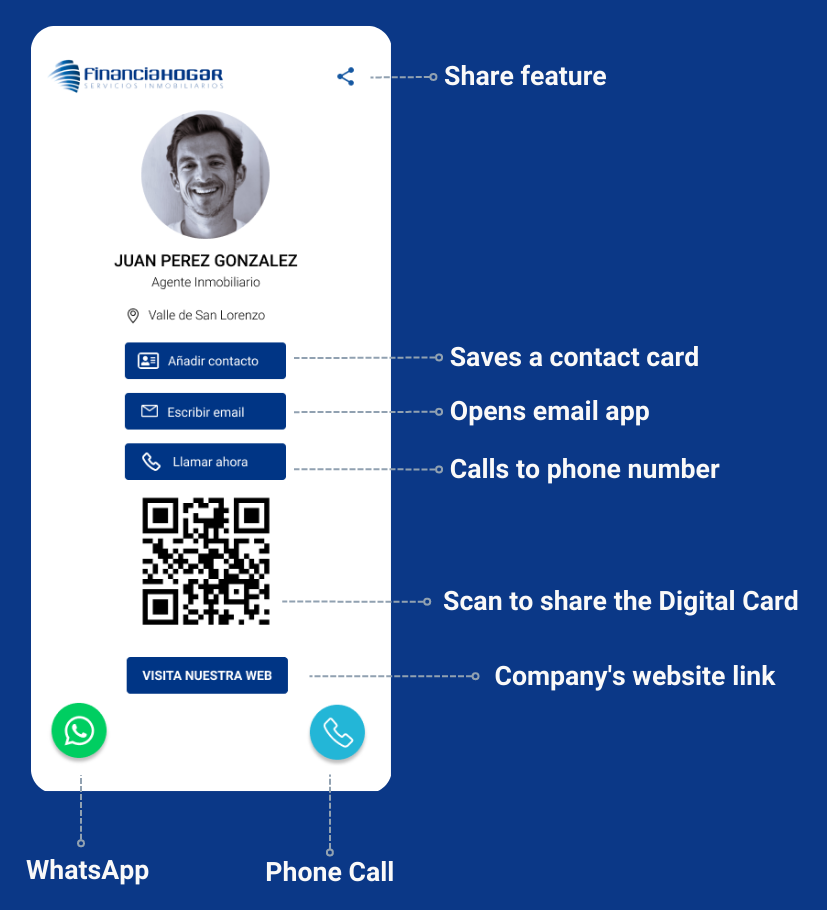
To address these challenges, I worked closely with the client to understand their needs and developed a customized digital business card solution that incorporated the client’s branding, the agent’s contact information with phone and WhatsApp shortcuts to reaching them quickly, a share functionality (via email and social media) and a QR code-sharing option to reduce physical contact.
Additionally, I used WordPress as a content management system and Divi Theme for its visual builder, which allowed employees to easily edit and create new cards without needing any technical expertise. The system included a drag-and-drop interface, real-time preview, and the ability to easily add and edit text, images, and contact information.
The Process
To solve these issues, we needed to identify and fix the weaknesses of existing digital business card solutions, as well as design a distinctive and appealing product to help our client stand out in a crowded market. In addition, the solution required the usage of a simple, intuitive, and streamlined content management system for the editing and creation of business cards.
The Research
I conducted individual user interviews with eight real estate agents and five clients and a focus group session which allowed me to identify the key facts listed below:
- Many real estate agencies struggle to keep their agent’s contact information up-to-date and consistent across all their marketing materials.
- Some agents prefer to use QR codes for quick and contactless sharing of their business card information, while others prefer to exchange physical cards or send the information via SMS or WhatsApp.
- Clients and potential clients appreciate having access to an agent’s contact information in various formats, including phone, email, and social media.
- Real estate agencies value the ability to customize their digital business cards to represent their brand and personality better.
- Many clients prefer to have a physical business card as well, so having the option to print out a physical version of the digital card would be helpful.
- Users value the ability to quickly and easily share contact information, and appreciate the convenience of a QR code for quick contactless sharing.
Competitive Analysis
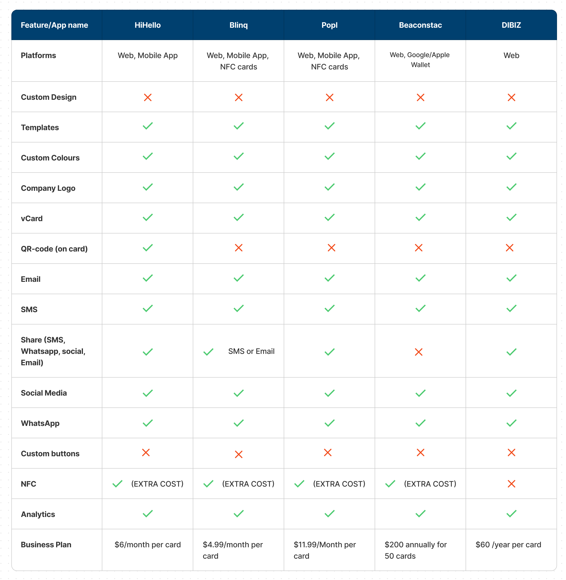
During the Competitive Analysis, I found out that there are currently a few digital business card solutions available in the market.
However, despite the availability of these solutions, there was still a need for a digital business card solution that is more user-friendly, visually appealing, and better meets the needs of FinanciaHogar.
The User Personas
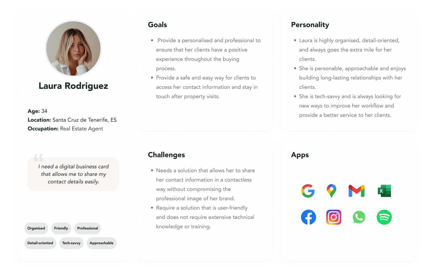
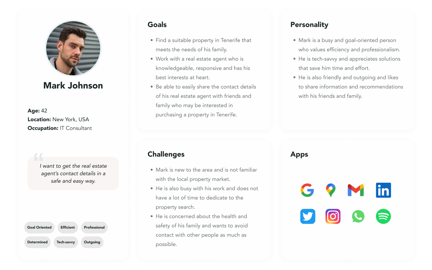
I created 2 user personas based on my research to represent the different user types that might use digital business cards. In this case, I found it helpful to have a Real Estate Agent as the frequent user and a Property Buyer as the infrequent user.
These personas helped me to understand the users’ needs, experiences, behaviours and goals, to create a great user experience for this target user group.
The User Flow
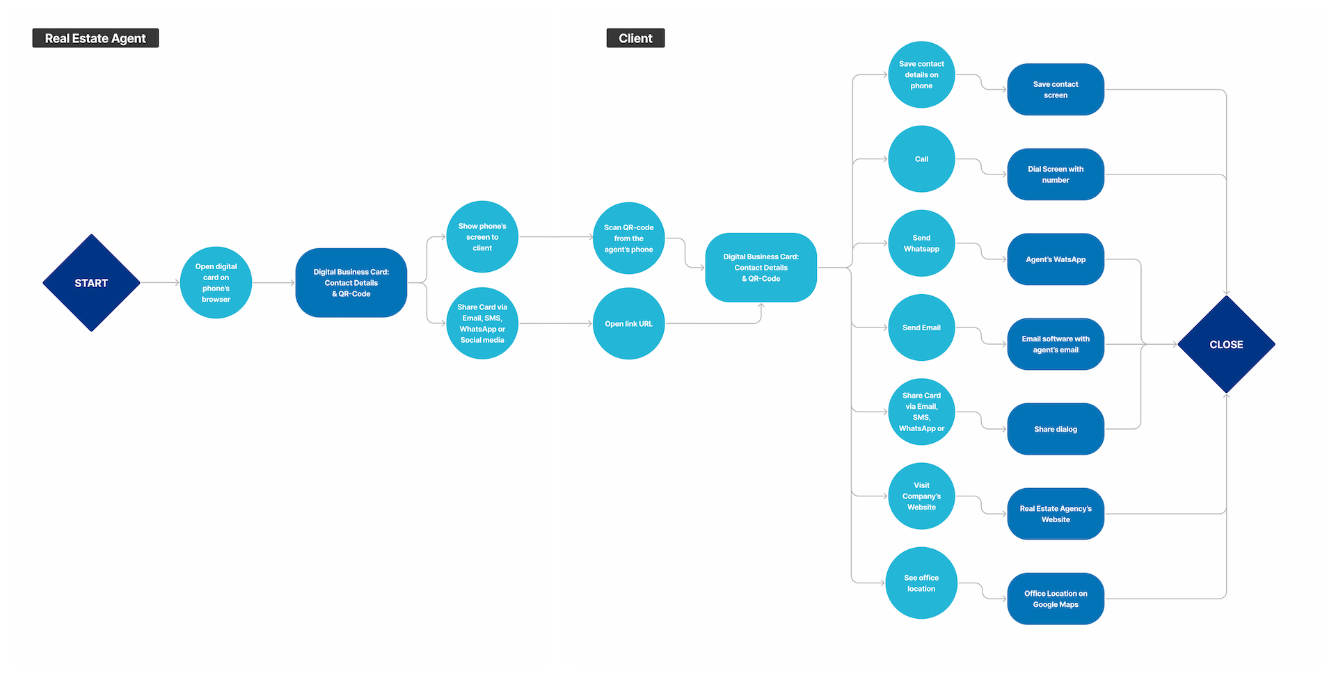
This user flow represents how Real Estate Agents can easily share their contact information with clients in a contactless way, and the client can easily save their information for future reference and contact them quickly. The clients can also access the office location, and the company’s website and easily share the business card with other people.
The Wireframes
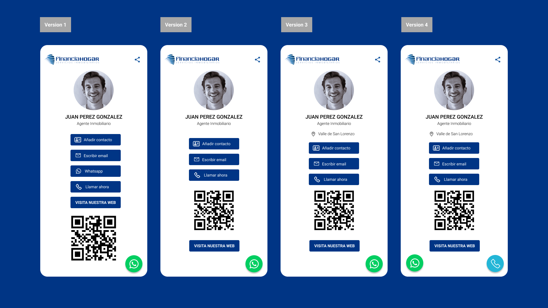
As part of the UX/UI design process for the digital business card project, I have created hand-drawn low-fidelity and digital high-fidelity wireframes. These wireframes were an important step in the design process as they provided a rough visual representation of the product’s layout and functionalities.
The objective of creating these low and mid-fidelity wireframes was to quickly iterate on and refine the product’s design without getting bogged down in details. In this stage, we tested different design approaches and got feedback from stakeholders before investing significant time and resources into the development of the final product.
The Prototype
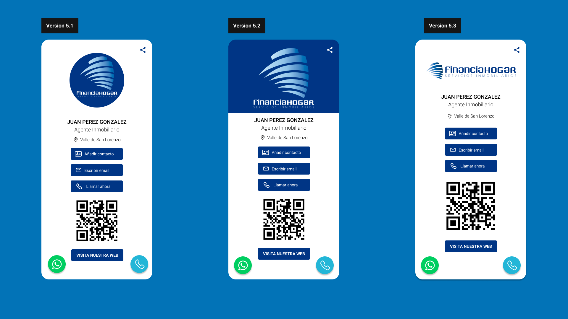
I created a high-fidelity prototype for user testing with Figma. It involved incorporating feedback from stakeholders and implementing visual design elements to create an intuitive and polished user experience.
- 80% of real estate agents found the digital business card design to be easy to use and navigate.
- 60% of agents expressed interest in having the ability to customise certain elements of the card, such as the background colour or font type.
- 70% of agents found the QR code feature to be particularly useful for quickly sharing their contact information with clients.
The Final Design
The final design of the digital business card was created using WordPress and the Divi Theme to allow for easy editing and quick deployment. It features the company’s logo instead of the agent’s profile picture (as per the client’s request) and a linked Google Maps location for the office. Users can quickly add the agent’s contact information to their phone’s contact list or contact the agent directly via email. A Facebook link and a button to visit the company’s website help drive traffic to its online presence. The QR-code feature allows for quick, contactless sharing of the business card, and the share functionality enables users to share via WhatsApp, email, or social media. Additionally, there are WhatsApp and phone shortcuts, with the phone button located on the right-hand side per the client’s preference.
THE RESULTS
- The digital business card solution is a long-term investment that provides significant benefits to the client’s business, such as a lower carbon footprint, reduced expenses, improved networking opportunities and increased brand awareness.
- The final product is a high-quality solution that meets the client’s specific needs and budget.
- The client was delighted with the backend system and reported significant time and cost savings as a result of being able to manage the cards themselves.
- FinanciaHogar’s employees have created more than 50 digital business cards without the need for design software and programming languages.
Key Takeaways
Designing and developing a digital business card solution requires a thoughtful approach that considers the needs of the user, the client, and any relevant health and safety concerns. The project can be complex and require a range of skills, including user research, visual design, development, and testing.
- User needs should be at the forefront of any product design project. Understanding the pain points and goals of users is critical to creating a successful solution.
In the age of COVID-19, contactless solutions are increasingly important. The pandemic has heightened the need for digital solutions that allow for safe and convenient communication. - Embracing new technologies: Digital business cards are a relatively new technology, but they can be a more sustainable and efficient alternative to traditional paper cards.
- Backend design is just as important: While much of the focus in UX/UI design is on the user-facing elements of a product, designing an easy-to-use backend is just as important to ensure that clients can edit or create new cards without relying on developers
- Collaborating with stakeholders is crucial for creating a solution that meets the client’s needs and fits within their budget and timeline.
- Iterative design and testing are essential to ensure that the solution is meeting the user’s needs and is easy to use. Continually gathering feedback and refining the solution based on that feedback is key to success.
Next Steps
- Conduct user testing with real estate agents and their clients to gather feedback and identify areas of improvement for the digital business card.
- Monitor analytics to track usage and engagement with the card, and make adjustments accordingly.
- Explore the possibility of integrating additional features, such as a chatbot for customer support or a scheduling tool for property viewings, to further enhance the user experience.
Bonus Track
In an updated version of the digital business card solution, I incorporated a dark mode function toggle that may significantly enhance user accessibility.
Incorporating a dark mode feature into the digital business card solution could be a simple but effective method for improving accessibility and user experience. Users with visual impairments or sensitivity to bright light may benefit from the addition of dark mode as an option, as will all users in certain instances, such as poorly illuminated places.
*To prove this hypothesis, the dark mode feature must be tested with real users to ensure that it meets their accessibility needs and preferences.

